PLATFORM.SH
Platform.sh had a powerful product, but prospective customers struggled to understand what it did and why it mattered. I led a research-driven homepage redesign that clarified the product story, addressed the needs of different audiences, and created clearer paths into the product.
ROLE
Lead Designer
FOCUS
UX Research · Strategy · Web Design
TIMELINE
2021 · 2 months
COLLABORATION
Marketing · Product · Engineering
01 / UNDERSTANDING THE AUDIENCE
Website analytics showed high bounce and low engagement on the homepage. We also repeatedly heard that prospective customers had trouble understanding what Platform.sh was, what made it different, and how it could solve their problems.
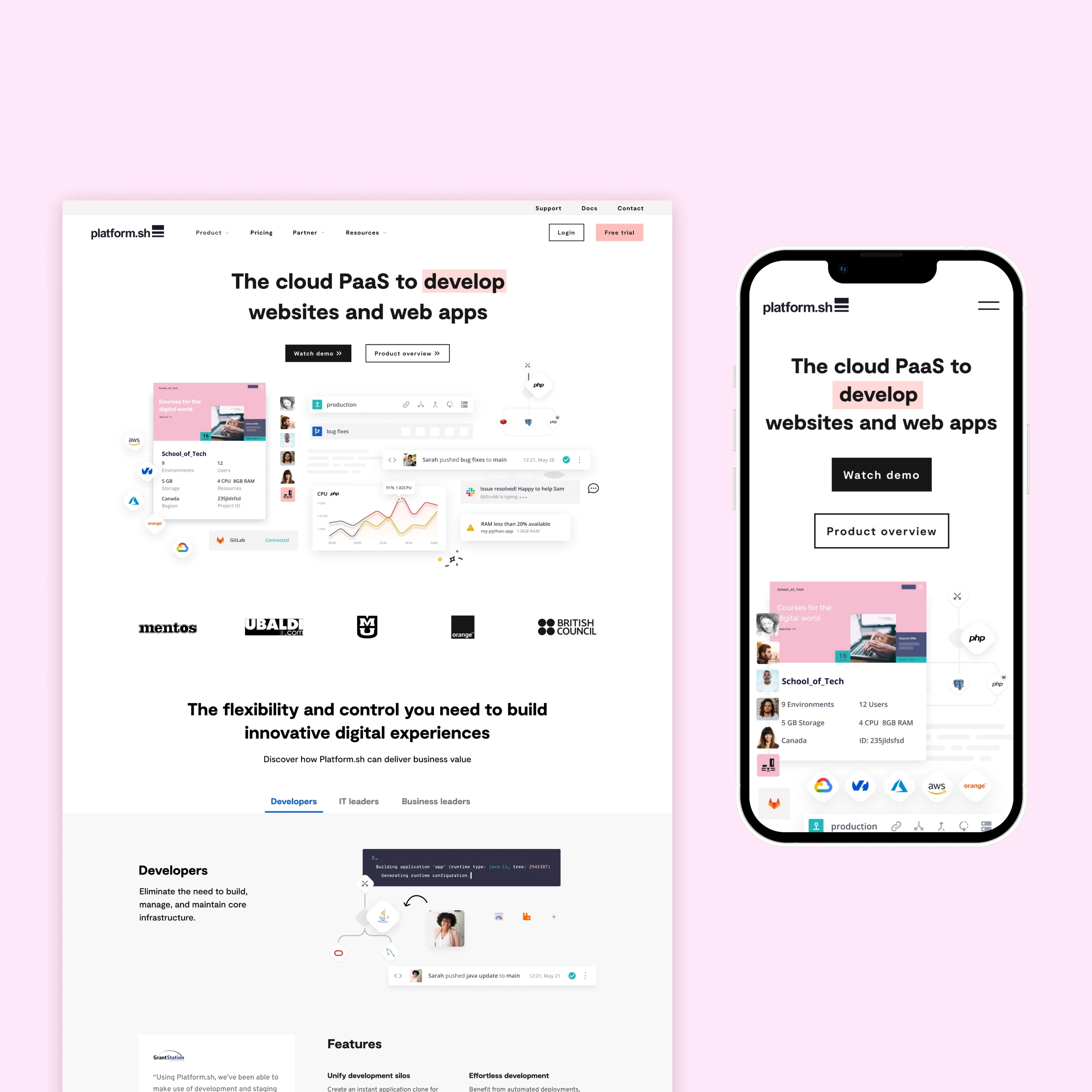
I interviewed 10 prospective users about the brand, messaging, and website, testing the existing homepage alongside an early redesign concept. The research showed that the existing experience felt ambiguous and overly reliant on jargon. Users wanted to understand the product and its differentiators faster, with imagery that actually helped explain how it worked.
Technical evaluators
Needed depth and evidence.
Developers and technical decision-makers wanted to quickly understand the product's competitive advantages, then dig deeper into technical capabilities, tools, and documentation.
Less-technical stakeholders
Needed clarity and context.
Business, procurement, security, and other stakeholders needed to understand what Platform.sh did and why it mattered without having to decode highly technical messaging.
02 / REDESIGNING THE STORY
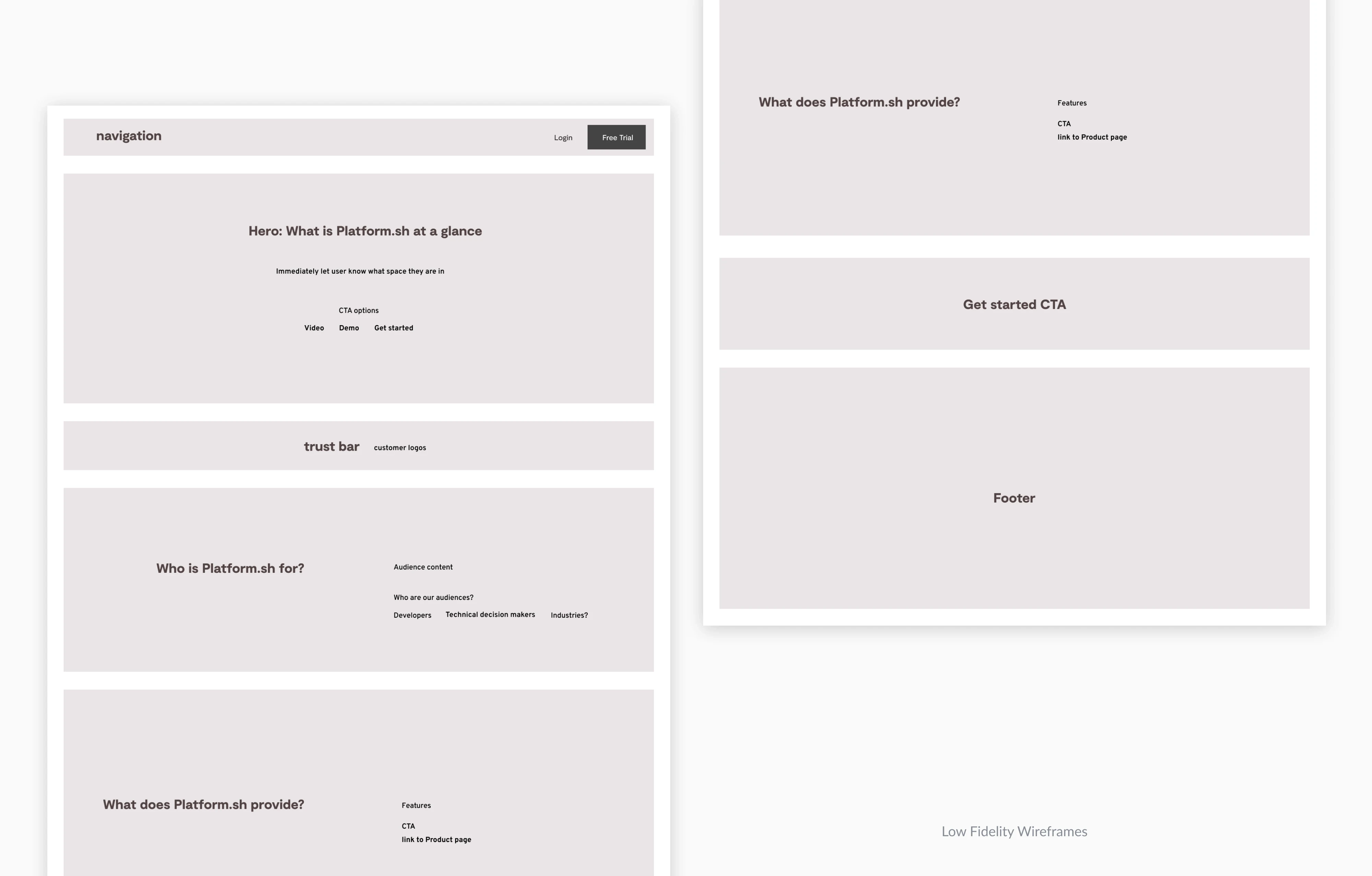
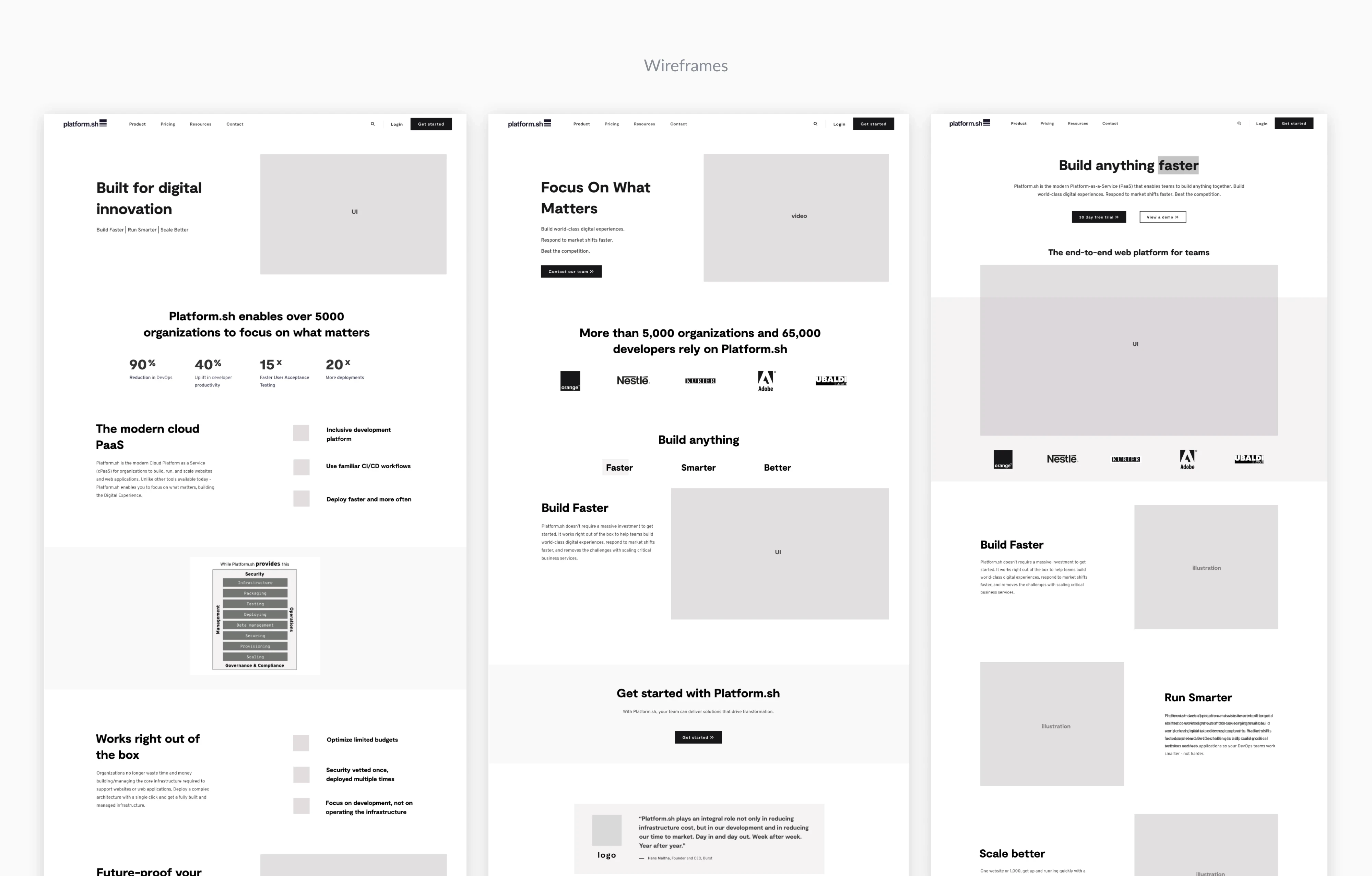
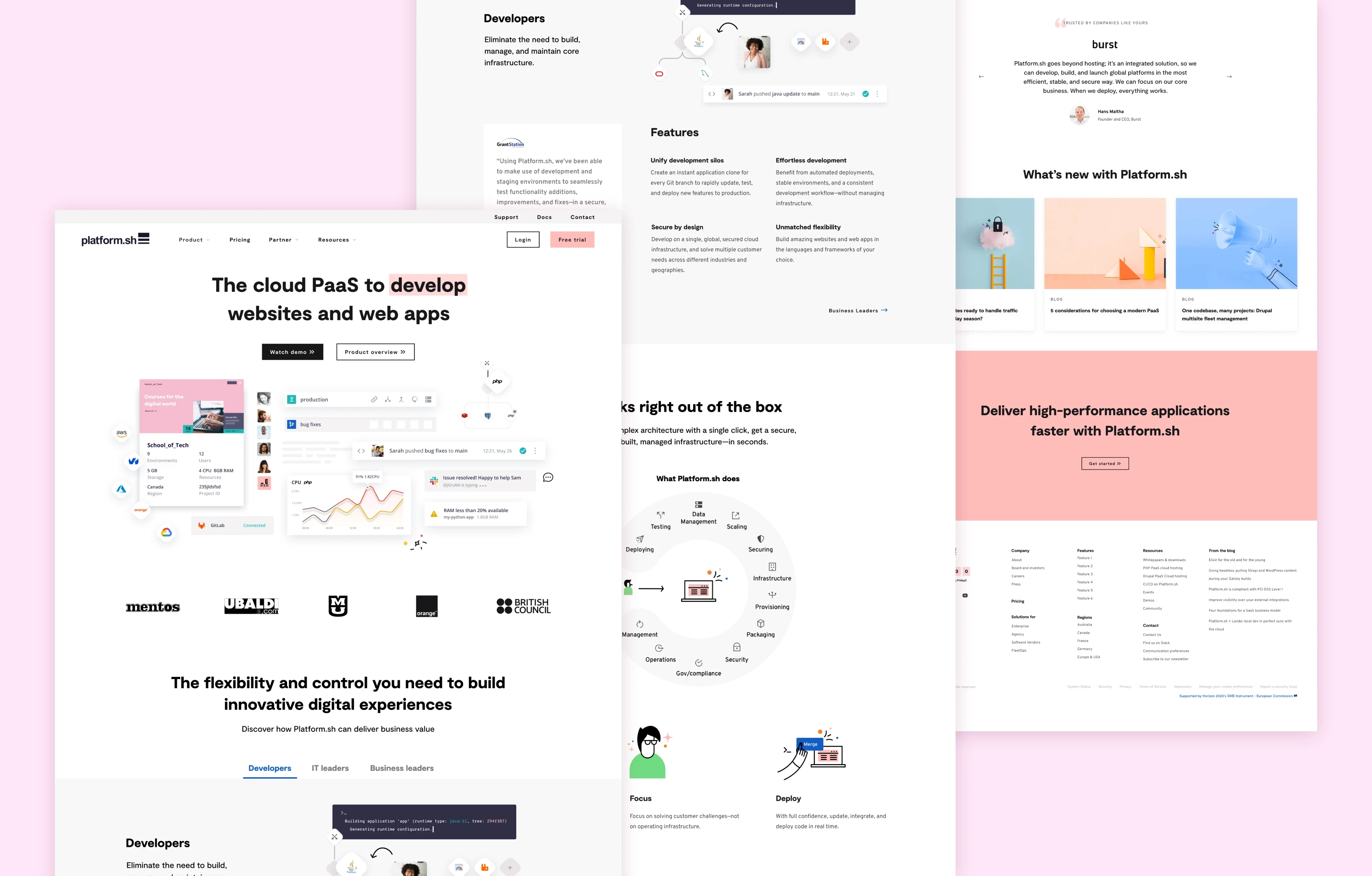
I restructured the homepage around a progressive story: establish what Platform.sh is, show the product in context, communicate its differentiators, and then give visitors clear paths to explore based on what they needed to learn next.
Explain the product immediately
Make the product tangible
Lead with credibility
Create paths to deeper information
INFORMATION ARCHITECTURE / WIREFRAMES
FINAL DESIGN

03 / RESULTS
+47%
Product Overview visits
+415%
Demo Video visits
−20%
Direct homepage → pricing visits
Within four days of launch, visitors were moving deeper into product-focused content. Product Overview visits increased 47%, while Demo Video visits increased 415%, contributing to more lead generation and free trial starts.
Visits directly from the homepage to pricing decreased 20%, while the total number of pricing-page visits remained stable. This suggested visitors were exploring and understanding the product before evaluating it on price.